The 10 Must-Have Features for Every High-Converting eCommerce Product Page
When someone lands on a product page, they’re this close to buying from you. They’ve clicked around, read about your brand, and something caught their eye. That product page is your big moment—and it needs to deliver. Ecommerce is all about selling online and facilitating online shopping as part of electronic commerce, which has transformed how businesses and consumers interact and transact. Ecommerce websites come in many forms, including those that sell products and services online. There are different types of ecommerce, such as B2C (business-to-consumer), B2B (business-to-business), and C2C (consumer-to-consumer), each representing a unique business model and approach to selling goods or services online.
At Muletown Digital, we’ve helped dozens of eCommerce brands fine-tune their product pages for higher conversions, fewer abandoned carts, and happier customers. Today, I’m walking you through 10 essential features that should be on every single eCommerce product page—plus a few bonus tips to take things up a notch. Your product page is a key part of your digital storefront, shaping the first impression and overall experience for your customers.
Whether you’re just launching or trying to improve an underperforming site, this checklist is your blueprint for success.
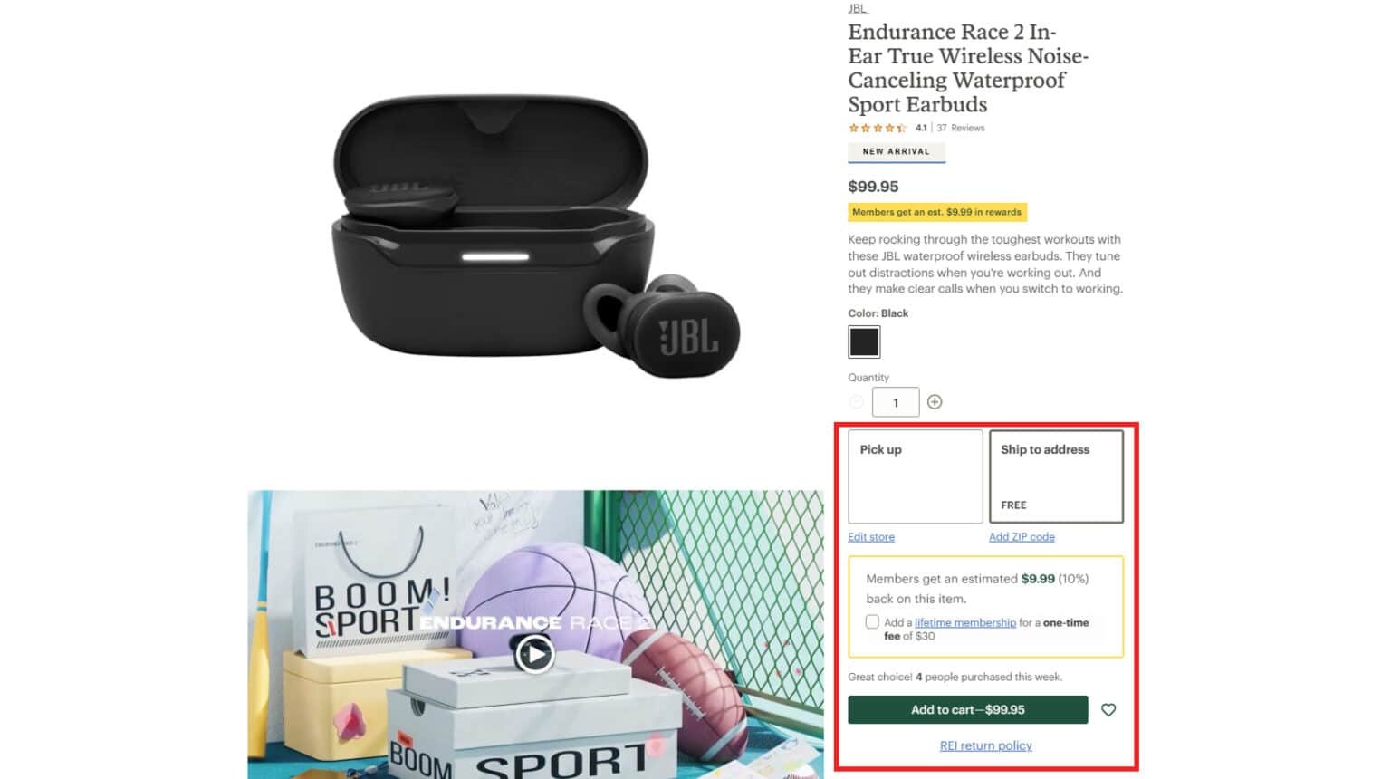
1. 🖼️ High-Quality Product Images for Your Ecommerce Website (and Video, If Possible)
First impressions matter. If your product photos are low-res, poorly lit, or inconsistent, your credibility instantly takes a hit. High-quality images are essential for any ecommerce website, serving as the digital storefront to attract and engage visitors. Compelling visuals are a key part of creating an appealing ecommerce storefront that draws in shoppers and encourages them to explore your products.
Your images should:
- Show the product from multiple angles
- Include close-ups of important details
- Feature the product in real-world or lifestyle settings
- Be mobile-optimized and quick-loading
Even better? **Add product videos.**A 30-second clip showing your product in action builds trust fast and answers questions that static photos can’t.
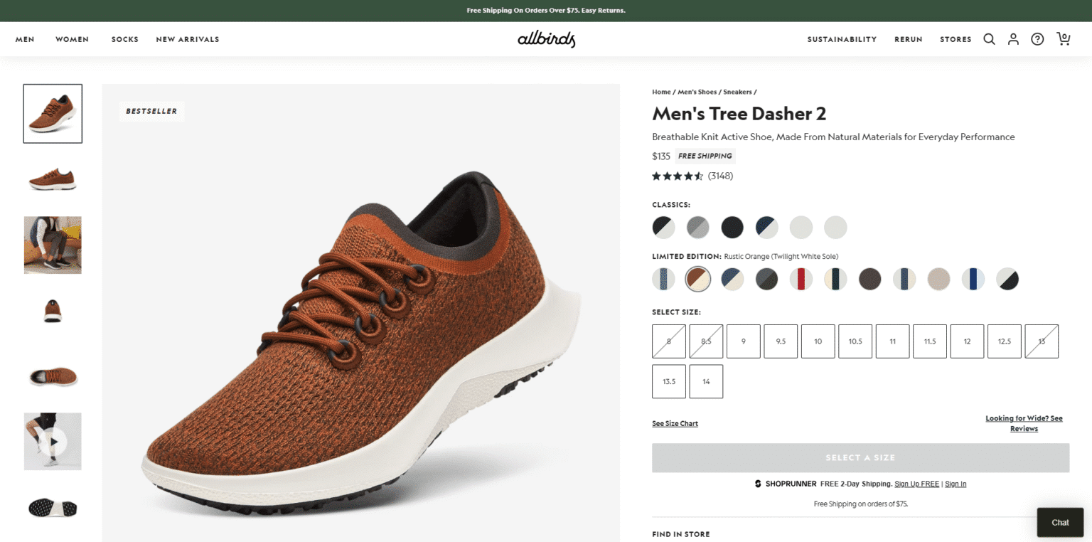
💡 Example: Allbirds nails this with multiple photos, color options, lifestyle imagery, and a short video that loops on hover.
2. 🔍 Clear, Search Engine Optimization (SEO)-Friendly Product Titles
Product titles aren’t just for humans—they’re for search engines too.
Instead of cryptic SKUs or overly clever names, use plain language that your customer would type into Google.
Your product title should:
- Be searchable
- Be specific (include key features like size, color, material)
- Include your SEO target keyword (naturally). Using search engine optimization strategies in your product titles helps them rank higher in search results and attract more shoppers by increasing online visibility.
- Help customers find your products easily through search and on your site.
3. 📝 Compelling Product Descriptions That Sell
Your description is where the magic happens. Make sure to clearly communicate the value of your products or services, ensuring that your target audience understands exactly what you offer and why it matters to them. Effective product descriptions are especially important for businesses aiming to sell products online, as they help convert visitors into buyers in the digital marketplace.
Avoid generic one-liners. Instead, highlight benefits:
- Tells a short story or use-case
- Highlights benefits features
- Speaks to your customer’s pain points
- Is scannable with bullet points
4. 💰 Transparent Pricing and Clear Discounts
No one wants to hunt for the price. Make it bold, visible, and easy to understand. Clear pricing information reassures customers and helps them feel confident when they are ready to pay online.
And if you’re offering a discount? Show both prices:
- ~$399~ $349 – Save $50!
Bonus tip: Use urgency like “Sale ends Friday!” or “Only 3 left in stock” to drive action.
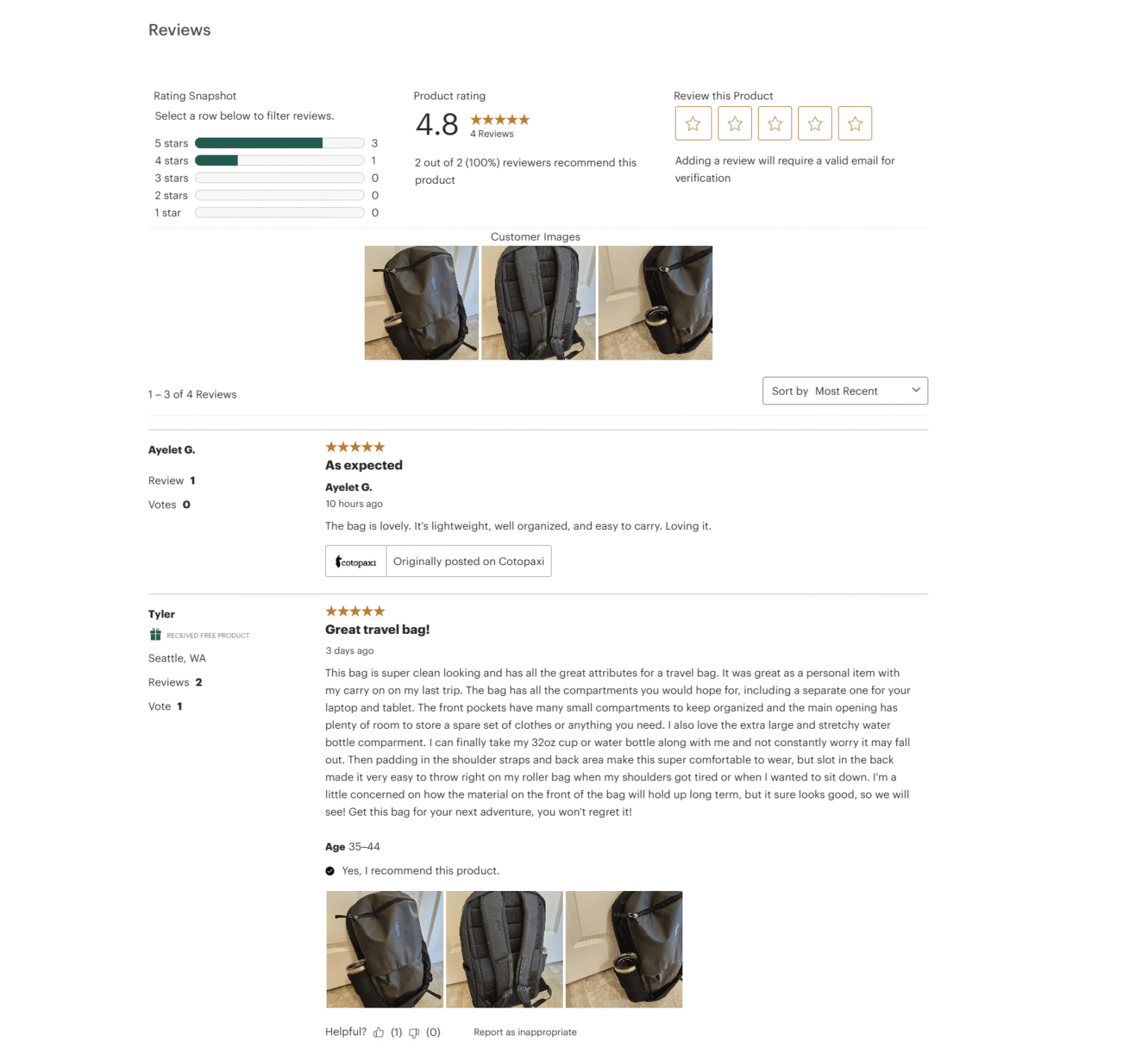
5. 🌟 Customer Reviews and Ratings
Displaying product reviews builds massive trust and gives new shoppers confidence. Reviews and ratings also help strengthen customer relationships by encouraging feedback and engagement.
What to include:
- Overall star rating
- Written reviews (good, bad, and in-between)
- User-submitted photos (if possible)
💡 Example: REI uses real photos and review filters that create shopper confidence.
6. 🎨 Variants, Sizes, and Customization Options
Let shoppers:
- Pick sizes, colors, and materials from dropdowns or swatches
- See real-time updates of price or product image based on selection
- Understand which variants are in stock
This avoids post-checkout confusion and missed expectations
7. 🚚 Shipping, Delivery, and Return Information
Be upfront about:
- Estimated delivery windows
- Shipping cost (or Free Shipping!)
- Return policies (e.g., “30-day no-questions-asked”)
Repeat this info near price and in a dedicated section further down the page.
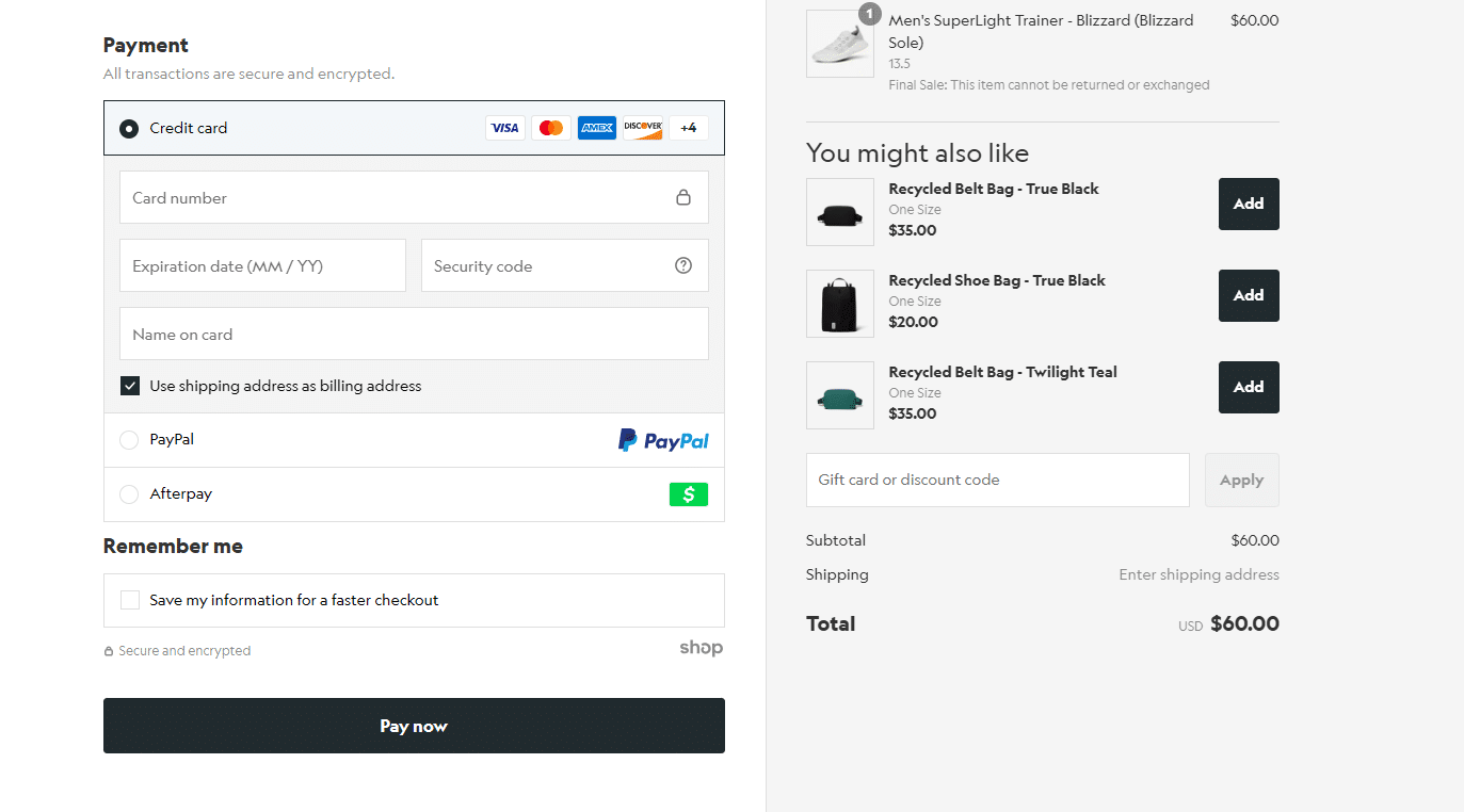
8. 🛡️ Trust Badges and Secure Checkout Indicators
Reassure buyers with:
- SSL / HTTPS padlock
- Logos of trusted payment gateways (Visa, Stripe, PayPal)
- “100% Money-Back Guarantee” style badges
- Industry affiliations (BBB, etc.)
These boost buyer confidence and legitimize your store. Trust badges and secure checkout are essential for protecting customers during online transactions
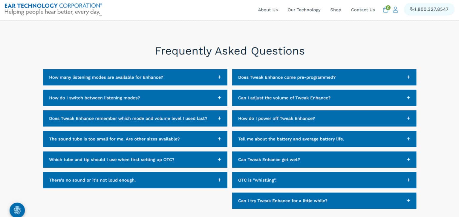
9. ❓ Product-Specific FAQs
Include 3–5 FAQs to eliminate doubt:
- Will this fit [insert use case]?
- Is this waterproof?
- How long does it last?
- What is the warranty?
- How do I install or use this?
Not only does this reduce support—it boosts conversions.
10. 🛒 Sticky “Add to Cart” Button + Cross-Sells
Let your Add to Cart button follow the user as they scroll, especially on mobile.
Also include:
- “You might also like” suggestions
- Bundles or related items
- Out-of-stock notifications (with email sign-ups)
These small touches lead to higher average order values and fewer missed opportunities. By making it easier for shoppers to complete their purchase, you can convert more customers and expand your reach.

🖥️ Special Considerations for Digital Product Pages
Selling digital products—like online courses, downloadable guides, software, or digital art—comes with its own set of challenges and opportunities for ecommerce businesses. Unlike physical goods, digital products require a different approach to website design and customer experience on your ecommerce website.
Mobile optimization is non-negotiable. With more online shoppers using mobile devices to shop online and make online purchases, your digital product pages must be fast, responsive, and easy to navigate on any screen. A seamless mobile commerce experience ensures you don’t lose potential customers at the final step.
Leverage customer data to personalize and improve. Successful ecommerce businesses use customer data to refine their marketing strategies, payment processing, and even the layout of their ecommerce site. By understanding how customers interact with your digital storefront, you can tailor your offerings, recommend related digital products, and streamline the checkout process to increase ecommerce sales.
Choose the right ecommerce platform and software. Not all ecommerce platforms are created equal when it comes to selling digital products. Look for ecommerce software that supports instant downloads, secure delivery, and flexible payment gateways. This not only simplifies your business processes but also boosts customer satisfaction by delivering products quickly and securely.
Stay ahead of ecommerce trends and customer expectations. The ecommerce landscape is always evolving, especially for digital products. Keep an eye on new ecommerce business models, emerging technologies, and changing shopping habits to ensure your online business remains competitive. Adapting your digital product pages to meet these trends will help you attract customers and grow your ecommerce sales.
By focusing on these special considerations, ecommerce businesses can create high-converting digital product pages that meet the needs of today’s online shoppers and set their online store apart in a crowded market.
⚙️ Seamless Tech: Integrations That Boost Conversions
In today’s fast-paced ecommerce landscape, having the right technology working behind the scenes can make all the difference for your online store. Seamless integrations aren’t just a “nice to have”—they’re essential for ecommerce businesses that want to deliver a smooth customer experience and increase sales.
Modern ecommerce platforms like Shopify and BigCommerce make it easy to connect your store with a wide range of third-party apps and services. By building a smart, cohesive tech stack, you can streamline everything from payment processing to shipping and marketing—freeing up your time to focus on growing your ecommerce business. Ecommerce tools can also help you manage your supply chain efficiently and expand your reach by selling across multiple online channels.
Here’s how the right integrations can supercharge your online store:
- Payment Gateways: Offer customers their preferred payment methods with trusted gateways like Stripe, PayPal, and Apple Pay. Fast, secure checkout means more completed online purchases and fewer abandoned carts.
- Shipping Providers: Automate shipping rates, tracking, and label creation with integrations for carriers like UPS, FedEx, and USPS. This keeps your customers informed and your operations running smoothly.
- Marketing Automation Tools: Connect your ecommerce site to email marketing, SMS, and retargeting platforms to nurture leads, recover abandoned carts, and drive repeat business—all on autopilot.
By leveraging these integrations, ecommerce businesses can create a unified, efficient ecosystem that not only meets but exceeds customer expectations. The result? Happier customers, streamlined operations, and a serious boost in ecommerce sales.
⚡ Bonus Features for Mobile Devices (If You Want to Go Next-Level)
- Live Chat for real-time support
- Breadcrumb Navigation to keep shoppers oriented
- Social Sharing tools
- AR or 3D views for complex or visual products
- Trust Guarantees like satisfaction or return policies
- Social Commerce Features such as shoppable posts or social storefronts to enable direct purchases from social media platforms
- Dedicated Mobile App to provide a seamless shopping experience and increase customer engagement
- Mobile Apps Compatibility to ensure your ecommerce site works smoothly with mobile apps, reaching customers wherever they shop
These mobile features help online brands deliver a seamless and consistent experience across all devices, supporting brand consistency in omnichannel environments.
🎯 Why This Matters for Customer Experience?
If you’re investing in traffic—via SEO, paid ads, or email—you need to convert that traffic into sales. And your product pages are where that happens. A well-designed product page guides shoppers through the customer journey, from discovery to purchase, ensuring a seamless and intuitive experience that increases engagement and conversions.
A well-optimized product page:
- Converts more visitors into buyers
- Reduces support requests
- Builds long-term trust
- Boosts SEO
- Raises average order values

🚀 Final Thoughts: Small Fixes, Big Gains
If your traffic’s up but sales are flat, your product pages could be the weak link.
Muletown Digital, we help brands like yours fix that.
Want us to take a look at your product pages?
Let’s turn browsers into buyers.
Ready to improve your eCommerce website?
Contact us at Muletown Digital for expert web design, SEO, and marketing services that will elevate your business.
Other Helpful Digital Marketing Insights
© Copyright 2025 Muletown Digital, LLC. All Rights Reserved.